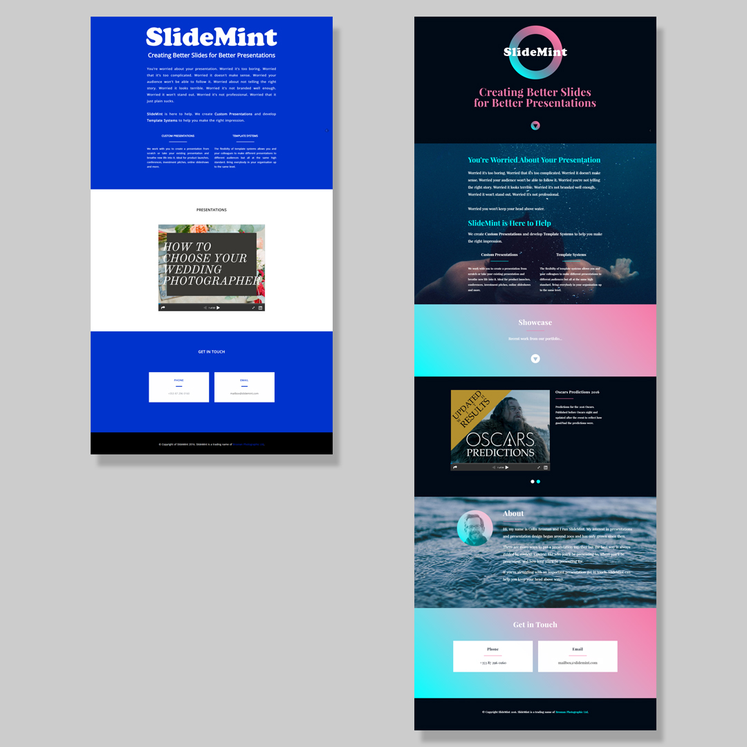
Yesterday the second version of the SlideMint website went live.
The first version of the website was very much a make it live as soon as possible job. As a result it was incredibly basic. The new version has a little bit extra content but is mostly about the look of the site. It needed to be made more appealing looking to visitors.
Every website tells a story and that story must match the story the business wants to tell. A badly designed website for a design related business tells the wrong story. It says these guys have no idea about design.
Here are version one and two side by side for comparison.
The website could certainly do with more content. All that’s been added in this version is an about section and a second presentation. The copy on the site is unchanged from version one. Laid out differently but that’s about all.
Version two is a lot better than version one but remains a work in progress.
If you have a minute I’d love to hear any feedback you have on the site. What can be improved?
